In the ever-expanding wellness market, the Neuro brand has emerged as a refreshing and innovative player. With a focus on helping people achieve the right state of mind, Neuro offers a range of gum and mints packed with high-quality, functional ingredients. This branding design case study review delves into the success story of Neuro and explores the key elements that have propelled its rise to prominence in the market.
The Birth of Neuro
Neuro’s journey began with a vision to create a brand that not only offered functional products but also provided a delightful sensory experience. The founders recognized the need for a product that not only tasted great but also delivered on its promises. With this in mind, they embarked on the mission to create a brand that would revolutionize the way people approach wellness.
Crafting a Distinct Visual Identity
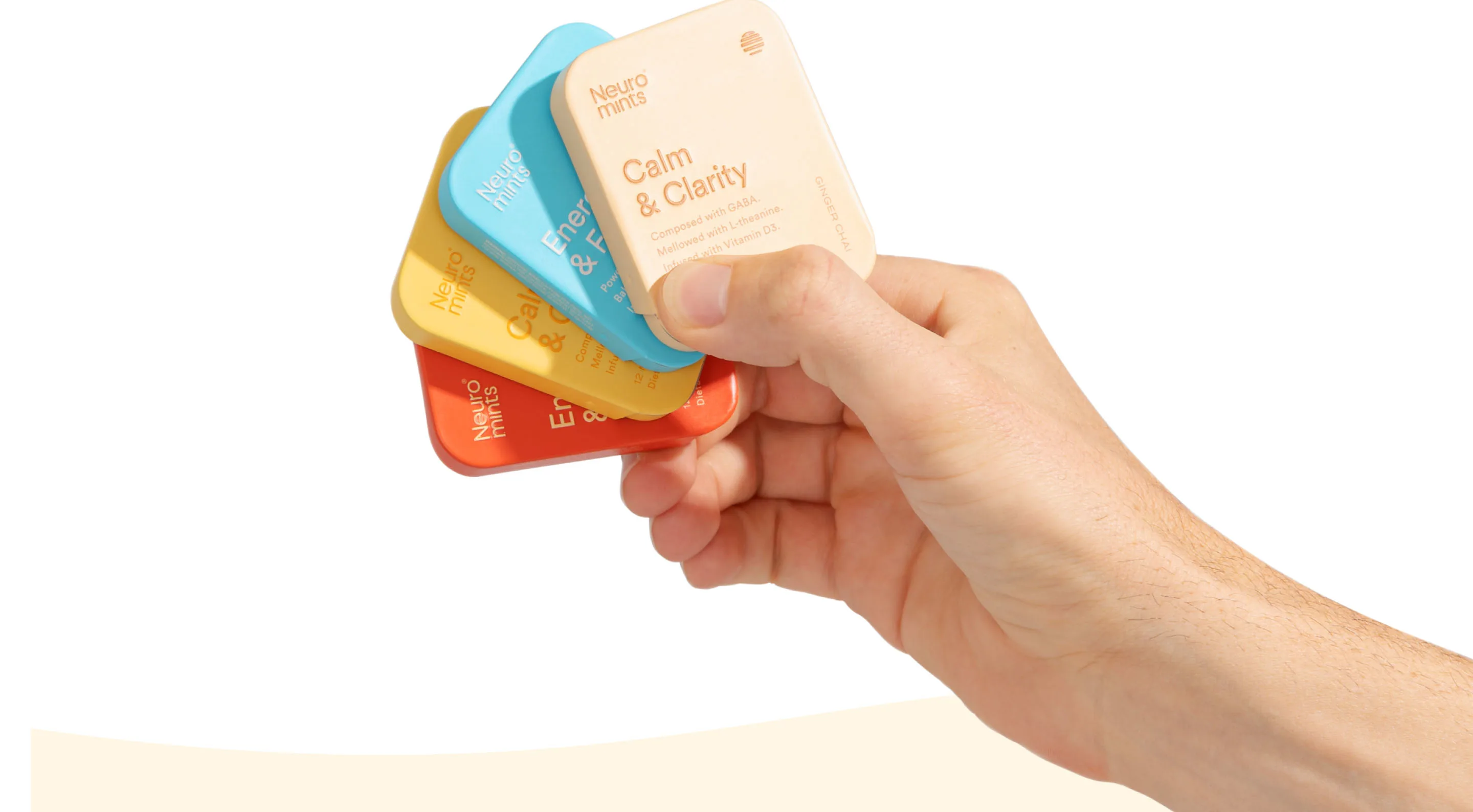
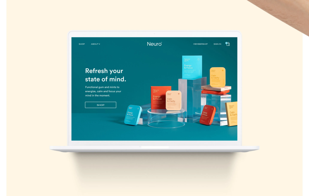
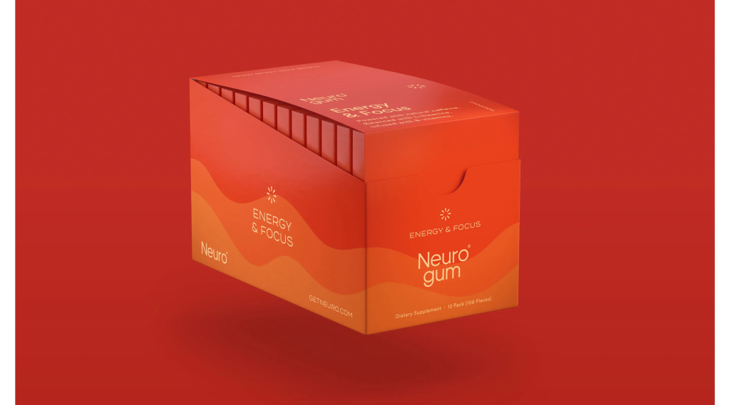
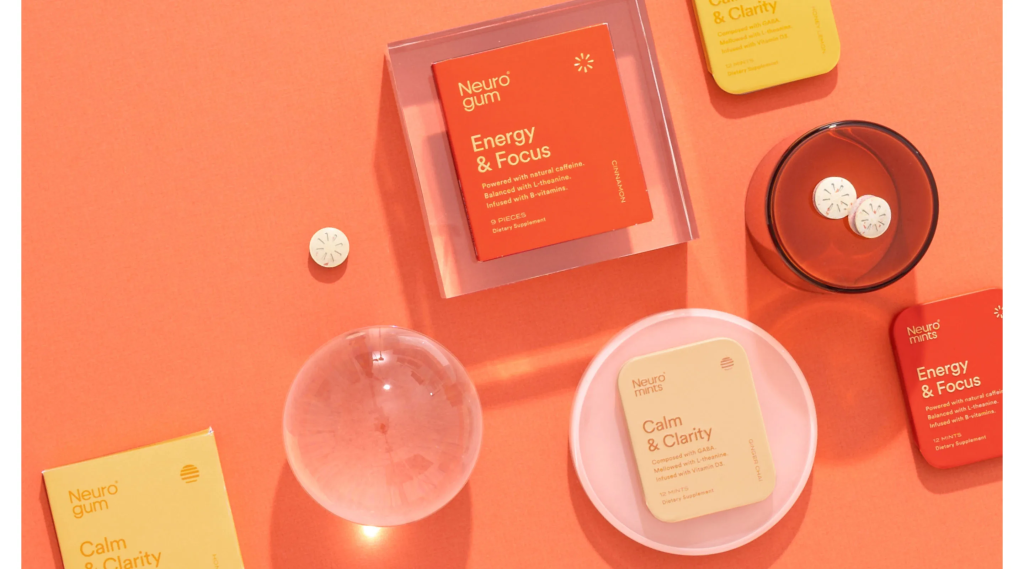
One of the essential aspects of Neuro’s branding success lies in the creation of a distinct visual identity. The brand’s designers meticulously crafted a logo and packaging that captured the essence of Neuro’s mission. The logo, with its clean lines and modern typography, evokes a sense of trust and professionalism. The packaging design, characterized by vibrant colors and eye-catching patterns, instantly grabs attention and creates a strong visual presence on the shelves.
The designers took inspiration from the functional ingredients present in Neuro’s products to develop a visual language that resonates with the target audience. The use of nature-inspired colors and organic shapes conveys a sense of purity and naturalness, aligning perfectly with Neuro’s focus on wellness.
Emphasizing Functionality Through Typography
Typography played a crucial role in conveying Neuro’s message of functionality. The brand’s designers carefully selected a typeface that exudes a sense of modernity and sophistication. The clean, sans-serif font used in Neuro’s marketing materials and packaging contributes to the brand’s overall sleek and contemporary aesthetic.
To further emphasize the functional aspect of Neuro’s products, the designers experimented with font weights and sizes. Bold typography was used to highlight key information about the functional ingredients, while smaller, lighter fonts were employed for secondary details. This deliberate typographic hierarchy ensures that the product’s benefits are effectively communicated to the consumer.
Creating a Cohesive Brand Language
A strong and consistent brand language is crucial for creating a memorable brand experience. Neuro has successfully achieved this through the integration of its visual elements across various touchpoints. From the website to social media posts and in-store displays, the brand’s visual identity remains consistent, reinforcing Neuro’s core values and creating a cohesive brand experience.
In addition to visual consistency, Neuro also pays attention to its tone of voice. The brand’s messaging is clear, concise, and infused with a sense of positivity and empowerment. Neuro aims to inspire its customers to live their best lives through the power of its functional products.
Expanding Nationwide Presence
Neuro’s branding efforts have not gone unnoticed. The brand’s success has led to its products being stocked in major national retailers such as Whole Foods, Walmart, CVS, and Target. This nationwide presence has significantly contributed to the brand’s growth and has allowed Neuro to reach a wider audience.
The strategic placement of Neuro’s products in these retail giants reinforces the brand’s credibility and positions it as a trusted player in the wellness industry. The visually striking packaging design helps Neuro’s products stand out on crowded shelves, capturing the attention of consumers and leading to increased sales.
Positive Customer Reception
Neuro’s dedication to creating high-quality, functional products paired with visually appealing branding has resonated with consumers. The brand has garnered positive reviews, with customers praising both the taste and effectiveness of Neuro’s gum and mints.
The brand’s commitment to customer satisfaction extends beyond the product itself. Neuro’s website provides a seamless user experience, allowing customers to easily navigate and make purchases. The brand’s social media presence further enhances the customer experience, with engaging content and interactive campaigns that foster a sense of community among Neuro’s customers.

Conclusion
Neuro’s branding design case study serves as a testament to the power of effective branding in driving the success of a wellness brand. By focusing on creating a distinct visual identity, emphasizing functionality through typography, and maintaining a cohesive brand language, Neuro has positioned itself as a leader in the industry. The brand’s nationwide presence and positive customer reception are a testament to the effectiveness of its branding strategy.
If you’re looking to elevate your brand’s visual identity and create a memorable brand experience like Neuro, our design agency, Kisstudio.xyz, can help. With our unlimited design subscription at only $2,499 per month, you can get design solutions that will make your brand stand out. Contact us today and let us transform your brand!